.png)
Yum Dee Lish Food App
Serving you restaurant experiences while taking your schedule into account

The Product:
Yum Dee Lish is a modern app that caters to the restaurant booking needs of busy professionals and independent freelancers who are constantly on-the-go. It allows for the user to filter their search according to their own specific needs & wants, and gives them the opportunity to earn restaurant discounts after leaving reviews.
Project Duration:
July 2021-November 2021
The Problem:
Busy professionals with stacked schedules don’t have a lot of time to spend looking up and booking restaurant visits.
The Goal:
Design an app for Yum Dee Lish that creates a platform for working professionals to share their favorite restaurants while also booking restaurant visits and sharing their experiences with the community.
My Role:
Lead UX designer, UX researcher, Visual Designer, Project Manager.
Responsibilities:
User research, conducting interviews, paper & digital wire-framing, low & high-fidelity prototyping, conducting usability studies, accounting for accessibility, and iterating on designs.
The Process:
I conducted interviews and empathy maps in order to better understand the needs & wants of the target audience for this app. One of the primary user groups identified through the research was career-focused adults who have tight schedules.
This user group confirmed assumptions about Yum Dee Lish's users, but research revealed that time spent scrolling through the app was not the only concern that users had. Other user problems include personal interests, circumstances, and work/life challenges that make it difficult to commit to fulfilling booked reservations.
This is when I got to work to start the production of a solution for users.
Me with interview participants 'Albert' and 'Dimitri'

Persona:
Example
Based on the interviews I set up one persona. I referred to it throughout the entire product development process.
I conducted interviews and empathy maps in order to better understand the needs & wants of the target audience for this app. One of the primary user groups identified through the research was career-focused adults who have tight schedules.
This user group confirmed assumptions about Yum Dee Lish’s users, but research revealed that time efficiency was not the only concern that users had. Other user problems include personal interests, circumstantial situations, and work/life challenges that make it difficult to commit to fulfilling booked reservations.
Interviews:
Project background: We’re creating this app to help people effectively filter categorized restaurant searches to make their restaurant hunting easier and also leave informative reviews for new app users. We need to find out if the main user experience, finding restaurants and leaving reviews, is easy for users to complete. We’d also like to understand the specific challenges that users might face in the searching, viewing, reservation, and favoriting processes.
Research goals:
Determine if users can complete core tasks within the prototype of the food review app. Determine if the food review app is difficult to use.
Guiding Questions:
-
How long does it take a user to find and reserve a restaurant in the app?
-
Is navigation through the app easy?
-
Are there parts of the user flow where participants get stuck/confused?
-
What does a good review (that would compel one to try a spot) look like?
-
Does the app make it easy for users to find & make reviews?
-
Do users think the search/dropdown menu feature is helpful and/or useful?
-
Are there design changes we can make to improve the user experience with these features?
-
Are there reasons why people don’t use food review apps?

Persona: 'Sihle Ngwazi'
User Journey:
Mapping Sihle Ngwazi’s user journey revealed how helpful it would be for users to have access to the efficient Yum Dee Lish App so that it could help them reach their most important goals with the product.
.png)
User Journey Map of persona 'Sihle Ngwazi'
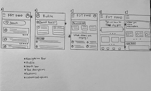
Paper Wireframes:
Taking the draft to draft the iterations of each screen of the app on paper ensured that the elements that made it to digital wireframes would be well-suited to address user pain points. For the home screen I prioritized a quick and easy navigation for the user to easily find restaurants and filter their search to their own needs, and save time.

Low-Fidelity Prototype:
The low-fidelity prototype connected the primary user flow of selecting a restaurant and making a reservation/booking according to the user’s calendar. This was done so that the prototype could be used in a usability study with users.
Usability Study Findings:
I conducted two rounds of usability studies. Findings from the first study helped to guide designs from wireframes to mockups. The second study used a high-fidelity prototype and revealed what aspects of the mockups needed refining.
Round 1 Findings:
-
Users want to find restaurants easily & quickly
-
Users want filtering options
-
Users want visible star & cost ratings to make selections easier
High-Fidelity Prototype:
The final hi-fi prototype presented cleaner user flows for booking a restaurant experience. It also met user needs for making reviews, finding reviews, checking profile information, and collecting discount points.

Round 2 Findings:
-
Calendar page needs to have better layout
-
Heading for looking at other reviews needs to be worded better
Accessibility Considerations:
Provided better access to visually impaired users by adding audible mic to pages for screen readers.
Made use of universal icons to help with easy navigation.
Used detailed imagery for profile pictures so that users could feel closer to reviews made by other users on the app.

UI Design:
Early designs allowed for customization, but after the usability study, I changed the restaurant name, added a carousel of images for the restaurant, added the restaurant address, included an audio tool for more accessibility, and included profile pictures for reviewers. I also revised the designs so that users see all the clickable options when they first land on the screen.
After conducting the second usability study, it was expressed that the calendar design needed to be more visually appealing to users. I replaced dropdown ‘time’ menu with a cleaner looking one that is easy for users to see.

Key Takeaways & What I learned:
Takeaway: This app makes users of the Yum Dee Lish app feel as if their restaurant booking needs are being met.While designing the Yum Dee Lish app.
What I learned: I learnt that with each stage of the design process, there is a constant need for feedback and iteration. I also learnt that there is no ‘perfect design’. Even when the product is launched, there will always be updates made on it.